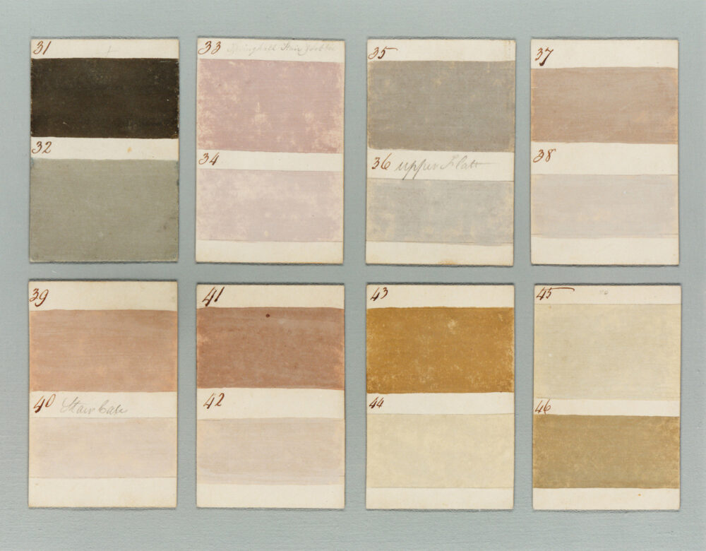
Four decades ago, when Patrick Baty was in Scotland researching the history of paint, he came across a brown envelope containing hand-painted pieces of card that dated back to 1807. They showcased 90 colours, ranging from stone and grey to pinks, blues, yellows and greens, that were used to paint the fine houses of the day.
“It was like finding the equivalent of a modern-day colour chart,” says Baty, a historian of architectural paint and colour who works as a consultant in the decoration of historic buildings. “The palette was soft and comfortable, with nothing brash or of the kind that would set your teeth on edge.”
Baty, who had not long joined Papers and Paints (the company founded by his father in 1960, which Baty still runs with his wife, Alex), reproduced almost all of the colours to create a modern paint collection. “They were the first genuine historic colours that came out in this country,” he says. “They would have formed part of the staple house-painting palette since the early 18th century.”
Since then the choice of colours available for decoration has grown, with hundreds to pick from. Some have evocative names that tell of their provenance – Cuisse de Nymphe Emue, a dusky pink shade from Edward Bulmer Natural Paint, was inspired by Petworth House in West Sussex. “Lord Egremont’s mother had painted the family rooms in pink, which was rather unexpected and wonderful,” says Bulmer, whose paints are made using plants and naturally occurring minerals. “It was she who gave the colour this risqué name, which is also the name of a rose in the garden [known in English as Maiden’s Blush].”
With so much choice, how do you select colours that will suit a country house? Baty believes that using shades within the original historic palette makes the process less daunting and creates a home that looks beautiful and feels comfortable. “Importantly, it also respects the building,” he says. “When dealing with a historic home, it is best to bear in mind the type and age of property, and what is appropriate. The building almost tells one what to do.”
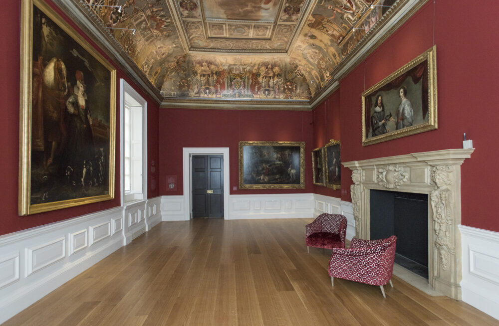
Bulmer agrees that following the style in which country houses were originally decorated is a good starting point. “This is the opposite of a lot of what is done today, but historically people used richer, more colourful shades in rooms they dwelt in, such as drawing rooms and dining rooms,” he says. “Neutral and paler colours were used in rooms that were passed through.”
“The entrance was painted the colour of stone,” says Baty. “Blue was traditionally used in bedrooms. Bright colours were reserved for smaller, private rooms.”
The natural setting of country homes can also influence a colour choice. “Using the views and elements of the exterior inside the home creates a link between interior and exterior, which is why greens, delicate blues and warm neutrals are all at home in country settings,” says Andy Greenall, head of design at Paint & Paper Library. “I would avoid a stark white, as it is often jarring and cold. Use warm neutrals that give a softness and depth while acting as a white in a wider scheme.”
Baty believes in keeping it simple. “Instead of umpteen off-whites, use just one except where there is specific need, such as on a ceiling,” he says. “There’s no need to paint every element in a different colour. And don’t use a variety of manufacturers, as the eggshell finish from one will be different to another.”
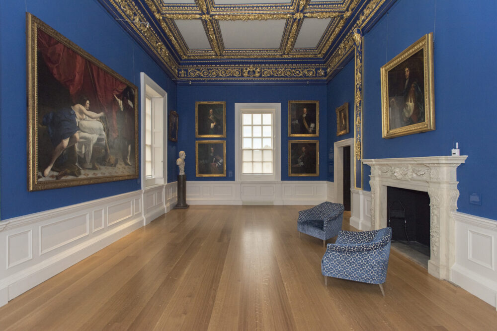
There’s also the state of the house to consider. “If it’s an inherited house with lots of possessions, these are generally more important than the paint, so colours need to be a backdrop,” says Bulmer, whose advice can be seen online at Create Academy. “For example, if you have lots of gilt frames, be careful of yellow. Green and blue on the wall behind them will look amazing. If it’s an empty house, you need to respond to materials that won’t require dressing, such as a wooden floor or marble fireplace.”
The amount of natural and artificial light in a room has an enormous impact on a colour’s appearance. Typically, paler colours are used in rooms with little natural light. “But there are certain situations where you have so little natural light that even a brilliant white paint is just going to look grey and sad,” says Baty. “In that case it’s better to go darker.”
Also, consider how the house works as a whole. “When choosing colours for particular rooms, consider the whole property and how rooms flow into one another, which areas you can see through an open door or along a hallway, to create a scheme that feels considered and coherent,” says Greenall.
When combining shades, whether it be with fabric, wallpaper or furnishings, Bulmer uses a colour wheel. “It’s a useful map of how colours work together and allows one to combine opposite hues harmoniously,” he says. “If you look across from yellow you’ll find blue, and across from red you’ll find green. If you combine these two opposites, you will get complementary contrasts. The tone of the colour is important too – we use earth pigments to add tone. This grounds a colour and makes it reliable with natural materials such as floorboards, and with furnishings that have some age to them.”
The ideal colour palette should feel timeless. “You don’t want a look that dates,” says Baty. “Avoid stylistic blips that will make you groan in a few years’ time. Think of your country house as a well-tailored suit that looks good without being in your face, and has a style that lasts.”
Pictures from top: Azurite sitting room (Edward Bulmer); 1807 colours; Cuisse de Nymphe Emue bathroom (Bulmer); Lorfords Antiques (Bulmer); King’s Presence Chamber (Patrick Baty); Queen’s Presence Chamber (Baty)


